(By Meryl Nass ) The NY Times runs a very detailed website, updated daily, with COVID cases, hospitalizations, tests, deaths, vaccinations. It is chock full of charts and graphs. Much of the data is granular down to counties. Some of it relates to the whole world. It’s a one-stop shop where you can find data on almost everything COVID-related.
The data come from the CDC.
But 2 companion graphs stopped–just came to a dead stop–on different weeks in March and April. The graphs are there, but when you examine them you see that they have not been updated in nearly 2 months. Yet the page states it was updated May 31, 2022.
What happened?
Here are the title and description of the graphs:
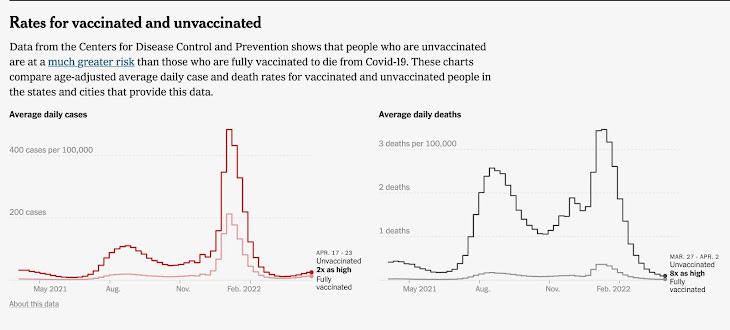
Rates for vaccinated and unvaccinated
Data from the Centers for Disease Control and Prevention shows that people who are unvaccinated are at a much greater risk than those who are fully vaccinated to die from Covid-19. These charts compare age-adjusted average daily case and death rates for vaccinated and unvaccinated people inthe states and cities that provide this data
CDC has been consistently reporting that cases and deaths in the unvaccinated were many times higher than in the vaccinated. CDC has claimed that the death rate from COVID was at least ten times higher if you were not vaccinated.
But then the two lines representing the vaccinated and the unvaccinated started closing in on each other on the CDC/NYT graphs. Rates of COVID cases and deaths in the vaccinated seemed to be about the same as in the unvaccinated by late March 2022.
Data from England showed that death rates by then had trended higher in the vaccinated.
Were COVID cases and deaths now higher in the US vaccinated, too?
CDC and the NY Times did something highly unusual. While everything else on this website is up to date, they simply cut off the 2 graphs below (comparing the vaxxed with the unvaxxed), on different weeks in March and April. The graphs remain, but the first graph (Daily COVID cases per 100,000) ended the third week of April. The second graph (Daily COVID deaths per 100,000) stopped abruptly the final week of March.