Is Vaccine Effectiveness Against Death Mostly a Statistical Illusion?
The Daily Sceptic – One of the big challenges in analysing the data on Covid has been definitions. What is a Covid death, what is a Covid case or infection? What the data appears to say can change radically depending on the definitions adopted.
This has been a particular issue with vaccination, as vaccination status is subject to a variety of conflicting definitions. In particular, when does someone count as vaccinated? Is it as soon as they have the needle in their arm, or do they remain ‘unvaccinated’ after that for a period of time, say seven, 14 or 21 days?
For instance, the recent ICNARC report stated the number of ICU admissions by vaccination status. But it also clarified that ‘unvaccinated’ includes those who received a jab less than 14 days prior to testing positive. This means that some (an unknown number) who were counted as unvaccinated had in fact received a dose.
This may be more than just a minor problem. For one thing, there is now a lot of evidence that people are more vulnerable to infection in the days following their jab, likely due to temporary immune suppression. This means a significant proportion of the vaccinated who are susceptible to infection with the current dominant variant are infected in the immediate post-jab period when in many studies and reports they don’t count as vaccinated. This creates a ‘survivorship bias‘ in the remaining vaccinated group that exaggerates vaccine efficacy. For instance, in a study of the U.S. nursing home population published in NEJM, once the post-jab period was included – when the vaccinated experienced higher incidence than the unvaccinated – the overall proportion of vaccinated and unvaccinated groups testing positive was the same at 6.8%. This makes it essential that all the data is presented, including for past-jab periods, and definitions are clear.
A similar problem occurs with the classification of deaths as vaccinated and unvaccinated. New analysis led by Norman Fenton, Professor in Risk Information Management at the University of London, has spotted a strange anomaly in the ONS deaths data that may be indicative of a deeper problem. He and his team noticed that if non-Covid deaths in the unvaccinated were plotted against time over the course of the vaccine rollout then a strange spike appeared during the rollout in which the mortality rate among the unvaccinated shot up to well above the background level. The same thing happened with the non-Covid mortality rate in the single-dosed as second doses were rolled out, and the phenomenon was repeated in each age group as vaccines were administered.
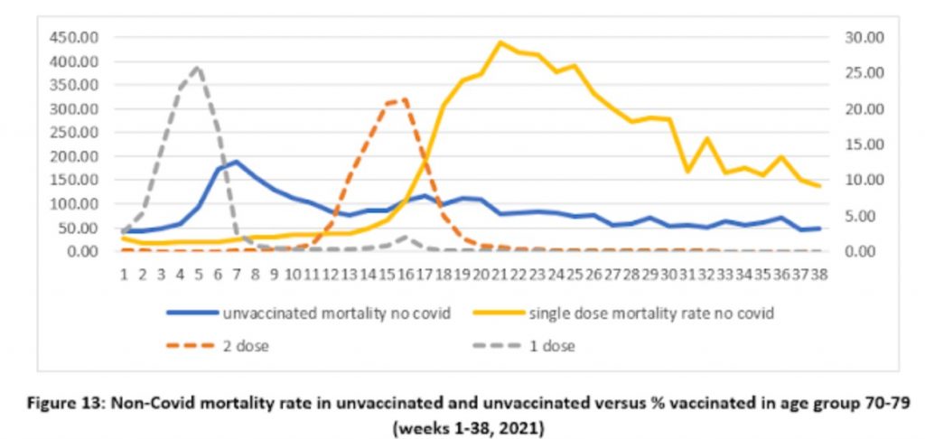
Since there is no reason that vaccination should impact on non-Covid mortality in this way, Prof Fenton and his team argue that this is evidence of a problem in the way the data is recorded or defined. In particular, if it is assumed that the unvaccinated in fact continue to die of non-Covid causes at the background rate and that the additional non-Covid deaths above that are deaths that are actually in the vaccinated but have been misclassified (owing, say, to not counting those who die within 14 days of their jab) then, they argue, a more realistic pattern emerges (see below).
In each age group there is now a spike in non-Covid deaths in the vaccinated right at the start of the rollout, which Prof Fenton and team argue makes sense as vaccination was prioritised for the most vulnerable who are more likely to die of any cause. Indeed, it was confusing in the original data that this initial spike was absent and the vaccinated died of non-Covid causes at a lower rate than the unvaccinated despite the most vulnerable being prioritised for vaccination.
The team discovered a different problem when they looked at Covid deaths by vaccination status. Here, the vaccines appear to be highly efficacious, but there is an anomaly that may again be indicative of deeper problems in the data.
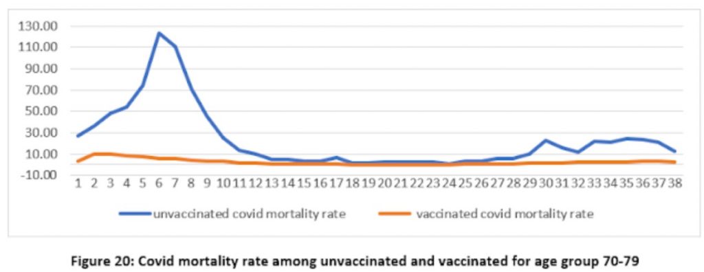
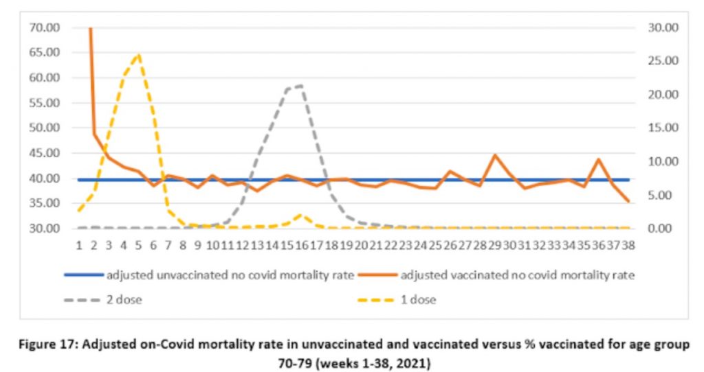
Again a spike appears in the unvaccinated mortality rate where there is none in the vaccinated. Fair enough, you might think, as the vaccines are protecting the vaccinated. However, it’s important to remember that the vaccines are not expected to work until 21 days after the first jab, yet here we have a spike in unvaccinated Covid mortality in the middle of the rollout before most of the vaccines should take effect – referring to figure 17 above we can see that the vaccine rollout in the age group peaked in week five, around the same time as the mortality rate in the unvaccinated peaked (week six), which all seems much too early.
Prof Fenton and team suggest that the problem here may be in the denominator, that is to say, in how many people are supposed to be in the vaccinated and unvaccinated populations when calculating the mortality rate each week. It’s important to realise that the populations here are changing fast as tens of thousands of people get vaccinated each week. Using the right figure for the right week therefore makes a big difference to the mortality rate reported. Could this anomalous spike in unvaccinated Covid deaths be an artefact of this kind of problem?
Professor Fenton thinks so. He suggests that the problem may be that the relevant denominator or number of people vaccinated for each week is not how many are vaccinated in the week a person dies but in the week they were infected, which is around three weeks earlier on average. What happens if the denominators are shifted by three weeks to allow for this? (Prof Fenton demonstrates the effect of shifting denominators in a short video of a hypothetical example here.)
The effect is remarkable, as shown below (note the change of scale on the y-axis).
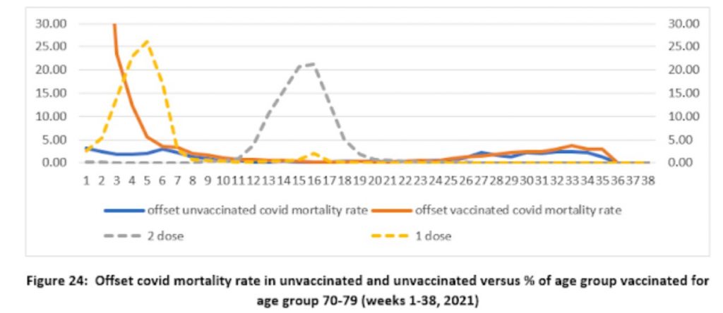
Shifting the population denominator estimates by three weeks means that the number of vaccinated for calculating the vaccinated mortality rate becomes much smaller, making the mortality rate much higher, while the denominator for the unvaccinated becomes much larger, making the mortality rate much lower. This massively reduces the mortality rate in the unvaccinated to low levels – to under five deaths per 100,000 people throughout the period, rather than as many as 125 per 100,000 in week six previously. Instead, a mortality spike appears in the vaccinated at the start of the vaccine rollout (though note that the scale is smaller so it only reaches 30 per 100,000 people), which may make sense as the vulnerable were prioritised for vaccination and at this point the population of vaccinated was small, so contained a high proportion of vulnerable people. Prof Fenton remarks that it also tallies with what we know of the increased vulnerability of the recently-vaccinated to infection, as noted above.
The shift in population estimates also greatly reduces the implied effectiveness of the vaccines in the autumn wave, where the lines are now much closer to one another, which is in line with findings from Sweden and elsewhere as vaccine efficacy wanes. Prof Fenton suggests that once you take into account the initial spike in the vaccinated, then this new analysis suggests there is “no reliable evidence that the vaccines reduce all-cause mortality”.
So is this what’s going on? There are certainly anomalies that need to be explained, and the analysis by Professor Fenton and team makes a lot of sense. It deserves to be taken seriously by the ONS and UKHSA.
Stop Press: Watch Prof Fenton discussing his team’s findings with Maajid Nawaz on LBC radio